ActionButton
Un botón primario que cuenta con un indicador de actividad y un icono.
Uso
import React from "react";
import { View, Text } from "react-native";
import { ActionButton, Theme } from "@ga-innoval/react-native-ui";
export function Component() {
return (
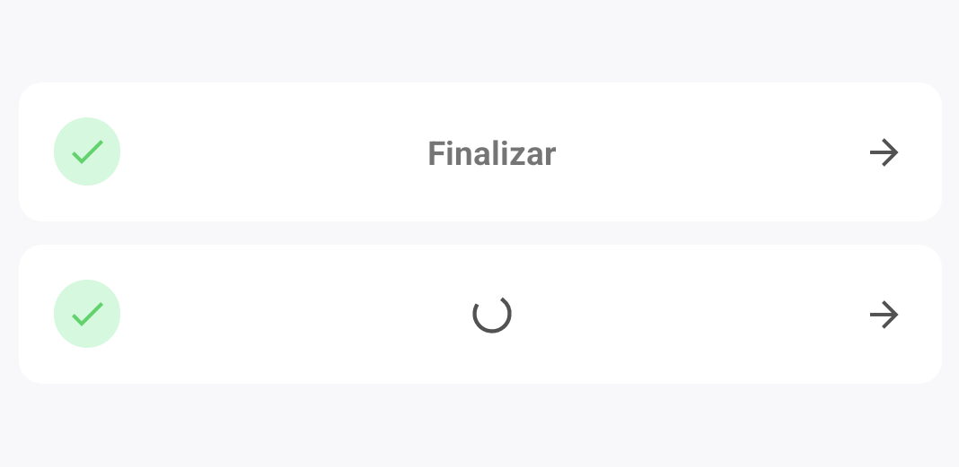
<ActionButton
text="Finalizar"
icon={{
name: "check",
color: Theme.colors.success,
backGroundColor: Theme.colors.lightSuccess,
}}
onPress={() => console.log("pressed!")}
loading={false}
/>
);
}
Props
text
Type: string
Texto a mostrarse dentro del botón.
onPress
Type: () => void
Función a ejecutarse al presionar.
backgroundColor
Type: ColorValue
Color del botón.
icon?
Type: { name: IconName, color: ColorValue, backgroundColor: ColorValue }
Nombre del icono a mostrar (react-native-vector-icons).
loading
Type: boolean
Estilos personalizados para el botón.
Pressable Props
Este componente incluye todas las propiedades del componente Pressable.